Learn how to choose colour combinations for mandala art using warm, cool, pastel, contrast and monochrome palettes in Lesson 21.
Course: Mandala Art Academy
Module: Colouring Techniques
Lesson: 21
Skill level: Beginner to intermediate
Practice time: 45 to 60 minutes
Welcome to Lesson 21
Welcome to Module 4 of the Mandala Art Academy. You have already learnt how to draw mandalas using grids, petals, leaves, dots, lotus patterns, paisley shapes, geometric designs, sunburst patterns, borders and large layouts.
Now it is time to bring those designs to life with colour.
Colour can completely change the mood of a mandala. The same black-and-white design can look peaceful, festive, bold, elegant or playful depending on the colours you choose.
In this lesson, you will learn how to choose colour combinations for mandala art in a simple and beginner-friendly way. You do not need advanced colour theory to start. You only need to understand how colours work together and how to repeat them evenly around the mandala.
Why are colour combinations important in mandala art?
Mandala art depends on balance, repetition and harmony.
When you choose colours carefully, the mandala looks more organised and pleasing. When colours are selected randomly, even a well-drawn mandala may look confusing.
A good colour combination helps highlight the centre, separate the layers and guide the viewer’s eye from the inside to the outside.
Colour can also show emotion. Soft colours create calmness. Bright colours create energy. Dark colours create drama. Metallic colours add richness.
Choosing colours before you start colouring will save time and help your final artwork look more polished.
What will you learn in this lesson?
By the end of Lesson 21, you will understand how to choose simple colour palettes for mandala art.
You will learn how to use warm colours, cool colours, pastel colours, contrast colours, monochrome shades and festive colour combinations.
You will also learn how to repeat colours symmetrically around a mandala and avoid common colouring mistakes.
The practice exercise will guide you through choosing and applying a colour palette to a small mandala design.
Materials needed
Use a completed black-and-white mandala outline from any earlier lesson.
You may use colour pencils, sketch pens, brush pens, gel pens, markers, watercolour pencils or crayons.
Keep a scrap sheet nearby to test colour combinations before applying them to the final artwork.
If you are using markers or brush pens, place an extra sheet under your drawing paper to prevent ink from bleeding onto the surface below.
Step 1: Look at your mandala before choosing colours
Before colouring, observe the design carefully.
Look at the centre, petal layers, borders, leaves, dots and outer edge.
Decide which areas should stand out the most.
Usually, the centre and main petal layers are the focus. Borders and small details should support the design.
Do not begin colouring immediately. Spend a few minutes planning the colour flow.
This small pause can make a big difference to the final result.
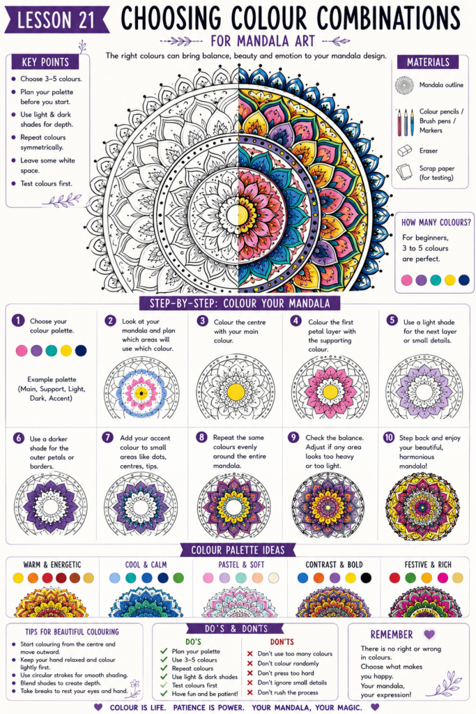
Step 2: Choose three to five colours first
For beginners, three to five colours are enough.
Using too many colours can make the mandala look busy.
A simple palette may include one main colour, one supporting colour, one light colour, one dark colour and one accent colour.
For example, you can choose pink as the main colour, purple as the supporting colour, light peach as the soft colour, deep magenta as the dark colour and gold as the accent colour.
Once you become more confident, you can try larger colour palettes.
Step 3: Understand warm colour combinations
Warm colours include yellow, orange, red, coral, peach and gold.
These colours make mandalas look bright, energetic and festive.
Warm palettes work well for sunburst mandalas, floral mandalas, Diwali-inspired designs, greeting cards and decorative wall art.
A simple warm palette can include yellow, orange and red.
A softer warm palette can include peach, coral and light brown.
A rich warm palette can include maroon, orange, mustard and gold.
Use warm colours when you want the mandala to feel joyful, powerful or lively.
Step 4: Understand cool colour combinations
Cool colours include blue, green, turquoise, teal, violet and mint.
These colours make mandalas look peaceful, calm and refreshing.
Cool palettes work well for meditation-inspired mandalas, watercolour designs, nature themes and relaxing artwork.
A simple cool palette can include light blue, turquoise and deep blue.
A fresh palette can include mint green, teal and navy.
A soft cool palette can include lavender, sky blue and pale green.
Use cool colours when you want the mandala to feel calm, balanced and soothing.
Step 5: Try a monochrome colour palette
A monochrome palette uses different shades of one colour.
For example, you may use light pink, rose, magenta and deep maroon.
You can also try light blue, medium blue, navy and indigo.
Monochrome palettes are excellent for beginners because they look harmonious easily.
They also help you practise shading and depth without worrying about too many different colours.
Use the lightest shade for small inner areas and gradually use darker shades towards the outer layers.
Step 6: Use contrast colours carefully
Contrast colours are colours that stand out strongly against each other.
Examples include blue and orange, purple and yellow, red and green or black and gold.
Contrast can make a mandala look bold and eye-catching.
However, too much contrast can feel harsh if every section uses strong colours.
Use one contrast colour as an accent rather than colouring the entire mandala with competing shades.
For example, if your mandala is mainly blue, use orange only in dots, petal tips or borders.
Step 7: Try pastel colour combinations
Pastel colours are soft and light.
They include baby pink, lavender, mint, peach, cream, pale yellow and sky blue.
Pastel palettes are perfect for soft floral mandalas, beginner art pages, greeting cards and peaceful designs.
A simple pastel palette can include lavender, mint green, peach and pale yellow.
Another beautiful combination is baby pink, sky blue, cream and light purple.
Pastels look especially good when the mandala has many delicate details.
Step 8: Choose a festive colour palette
Festive mandalas can use brighter and richer colours.
For Indian-inspired festive designs, try red, yellow, orange, green and gold.
For a royal look, try deep purple, magenta, emerald green and gold.
For a bright celebration palette, use pink, orange, turquoise and yellow.
Festive palettes work well for cards, rangoli-inspired mandalas, wall décor and handmade gifts.
Keep the colour repetition balanced so the artwork looks joyful rather than chaotic.
Step 9: Decide where each colour will go
After choosing your palette, assign each colour to a role.
Choose one colour for the centre.
Choose another for the main petals.
Choose a third colour for borders.
Choose a fourth colour for leaves, dots or small details.
Choose an accent colour for highlights.
This planning helps prevent random colouring.
You do not need to follow the plan perfectly, but it gives you a clear starting point.
Step 10: Repeat colours symmetrically
Mandala colouring should follow the same repetition as mandala drawing.
If you colour one petal pink, colour the matching opposite petals pink too.
If you use blue dots in one section, repeat the same blue dots in all matching sections.
This creates harmony.
Avoid colouring each petal in a different random colour unless the design is intentionally rainbow-style.
Symmetrical colour repetition makes the mandala look more professional.
Step 11: Colour from the centre outward
Start colouring from the centre of the mandala.
Then move slowly towards the outer layers.
This helps you maintain control and avoid forgetting your colour sequence.
Colouring from the centre outward also makes it easier to build a gradual effect.
You may use lighter colours near the centre and darker colours towards the outer edge.
This creates depth and makes the mandala feel more complete.
Step 12: Use light and dark shades for depth
A mandala looks more interesting when it has both light and dark areas.
Use lighter shades for small delicate details.
Use darker shades for outlines, borders or important petals.
If every colour has the same brightness, the mandala may look flat.
For example, use light pink for inner petals, rose for middle petals and deep magenta for outer petals.
This simple shade change creates depth without complicated blending.
Step 13: Use accent colours for small details
Accent colours should be used in small amounts.
Gold, silver, black, white, yellow or bright turquoise can work as accent colours depending on the palette.
Use accent colours for dots, petal tips, centre circles, borders or tiny highlights.
Do not use the accent colour everywhere.
A small amount of accent colour can make the design look special.
Too much accent colour can reduce its impact.
Step 14: Test colours before applying them
Always test colours on scrap paper before colouring the mandala.
Some pens look different after drying.
Some markers may bleed through the paper.
Some colours may look beautiful separately but not work well together.
Testing helps you avoid surprises.
Place the tested colours next to each other and see whether they feel balanced.
Step 15: Keep white space in the design
You do not need to colour every section.
Leaving some areas white can make the mandala look fresh and clean.
White space helps separate colours and prevents the design from becoming too heavy.
For example, colour only the main petals and leave some borders black and white.
You can also colour alternate sections and keep the rest empty.
White space is part of the design.
How can you choose colours when you feel confused?
Start with one favourite colour.
Then choose one lighter shade and one darker shade of the same colour.
Add one neutral colour such as black, white, cream, grey or brown.
Finally, add one accent colour.
This gives you a simple five-colour palette without confusion.
For example, if your favourite colour is blue, choose sky blue, medium blue, navy, white and gold.
This method works for almost any mandala design.
How can you match colours to mandala styles?
For floral mandalas, use pink, purple, yellow, green, peach or coral.
For lotus mandalas, use pink, lavender, blue, green or gold.
For paisley mandalas, use rich combinations such as maroon, teal, mustard, purple and green.
For geometric mandalas, use bold colours such as blue, black, orange, red, silver or gold.
For sunburst mandalas, use yellow, orange, red, brown and gold.
For large mandalas, use one main palette and repeat it carefully across all layers.
Beginner practice exercise
Draw or print a small mandala outline.
Choose only three colours.
Use the first colour for the centre and inner petals.
Use the second colour for the middle layer.
Use the third colour for the outer border and dots.
Repeat the same colours evenly around the design.
After finishing, observe whether the mandala looks balanced.
This exercise helps you understand how a small palette can still create a beautiful result.
Intermediate practice exercise
Choose five colours.
Select one main colour, one supporting colour, one light shade, one dark shade and one accent colour.
Apply the main colour to the largest petals.
Use the supporting colour in the next layer.
Use the light shade for small details.
Use the dark shade for borders.
Use the accent colour only for dots and highlights.
This exercise will help you practise colour planning and visual balance.
Colour palette ideas to try
A calm palette can use lavender, sky blue, mint green and white.
A floral palette can use pink, peach, green and yellow.
A festive palette can use red, orange, yellow, green and gold.
A royal palette can use purple, magenta, emerald green and gold.
A modern palette can use black, white, grey and one bright accent colour.
A sunset palette can use yellow, orange, coral, red and brown.
A ocean palette can use turquoise, teal, navy, aqua and white.
Common mistakes to avoid when choosing colours
Avoid using too many colours in your first attempt.
Do not colour randomly without deciding a palette.
Avoid using only dark colours because the mandala may look heavy.
Do not place strong contrast colours everywhere.
Avoid forgetting symmetry while colouring.
Do not use markers on thin paper without testing first.
Avoid rushing the colouring process after spending time drawing the mandala.
How can you make mandala colouring look professional?
Plan the palette before starting.
Use three to five colours for better control.
Repeat colours symmetrically.
Use light and dark shades to create depth.
Keep accent colours limited.
Leave some white space.
Test colours on scrap paper.
Colour slowly and stay within the lines.
A professional-looking mandala does not always need many colours. It needs thoughtful colour placement.
Homework for Lesson 21
Choose one mandala outline from any earlier lesson.
Create three different colour versions of the same design.
For the first version, use warm colours.
For the second version, use cool colours.
For the third version, use a monochrome palette.
Compare how the same mandala changes mood with different colour combinations.
Write down which palette you enjoyed the most and why.
Creative challenge
Create your own five-colour mandala palette.
Choose one main colour, one supporting colour, one light shade, one dark shade and one accent colour.
Use that palette to colour a small mandala.
Give your palette a name, such as sunset glow, lotus calm, festive joy or ocean peace.
This exercise will help you develop your own mandala colour style.
Key takeaways from Lesson 21
Colour combinations can change the entire mood of a mandala.
Three to five colours are enough for a balanced beginner design.
Warm colours feel energetic, while cool colours feel calm.
Monochrome palettes are easy and harmonious.
Contrast colours should be used carefully.
Accent colours work best in small details.
Repeating colours symmetrically keeps the mandala balanced.
White space helps the design look clean and polished.
Lesson summary
In Lesson 21, you learnt how to choose colour combinations for mandala art using warm colours, cool colours, monochrome palettes, pastel shades, contrast colours and festive palettes.
You also learnt how to assign colours to different mandala layers, repeat colours symmetrically, use accent colours and keep white space in the design.
This lesson begins your colouring journey. In the next lesson, you will learn how colour psychology can influence the mood and meaning of mandala designs.
Previous lesson: Lesson 20: Creating large mandala designs
Next lesson: Lesson 22: Understanding Colour Psychology in Mandala Designs
Support the free Mandala Art Academy
Learning mandala art with us? The Mandala Art Academy is completely free, and every contribution helps us create more step-by-step lessons, practice guides and original tutorial images.
Even a small contribution helps us continue the next lesson.
For supporters in India
Scan the QR code below or use the UPI ID to contribute any amount you are comfortable with.

UPI ID: pallavi.rags-1@okhdfcbank
Pay securely through Razorpay
Prefer to pay by card or another supported online payment method? Use our secure Razorpay page below. Indian and international cards are accepted.
Support Mandala Art Academy and help create the next free lesson
Your support is entirely optional. Every Mandala Art Academy lesson will remain free for everyone.
Thank you for learning with us and helping us create the next lesson. ❤️